

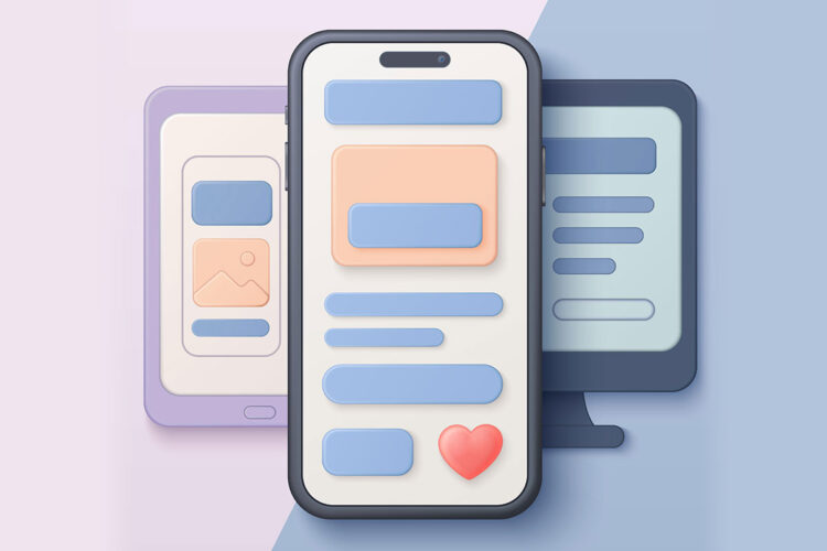
You’ve just hit “send” on that perfectly crafted marketing email. You’ve poured over the subject line, finessed the copy, and selected the most engaging visuals. Your desktop preview looks stunning. But then, you pull it up on your smartphone, and a wave of dread washes over you. Images are cut off, text is microscopic, columns are stacked haphazardly, and calls to action are nowhere to be found. Sound familiar? If so, you’re not alone. Mobile email display issues are a pervasive problem for marketers and communicators alike, and they can significantly impact the effectiveness of your email campaigns. In a world where over half of all email opens occur on mobile devices, ignoring these issues is no longer an option. This article will guide you through understanding, identifying, and ultimately resolving the most common mobile email display challenges, ensuring your messages resonate with your audience, no matter what device they’re using.
You might be thinking, “Do I really need to spend that much time on mobile email?” The short answer is an emphatic “yes.” The mobile landscape has shifted dramatically in recent years, making mobile optimization not just a best practice, but a fundamental requirement for successful email marketing.
The Rise of the Mobile-First Consumer
Consider your own habits. How often do you check your email on your phone versus your computer? For many, the smartphone is the primary, if not exclusive, gateway to their inbox. This shift isn’t a trend; it’s a permanent change in consumer behavior. Your audience expects a seamless experience, and if your email doesn’t deliver, they’ll likely move on.
The Impact on Engagement and Conversions
A poorly displayed email isn’t just an aesthetic inconvenience; it directly impacts your bottom line. When an email is difficult to read or navigate on a mobile device, several negative outcomes can occur:
Increased Delete Rates
If your email looks like a jumbled mess, recipients are far more likely to hit the delete button without even attempting to decipher its content. They have limited time and patience, and a frustrating experience will quickly lead to abandonment.
Reduced Click-Through Rates
Calls to action (CTAs) are the lifeblood of your email campaigns. If your buttons are too small to tap, obscured by other elements, or require excessive scrolling to find, your click-through rates will plummet. The path to conversion must be clear and effortless.
Damaged Brand Reputation
A consistent stream of poorly rendered emails can subtly erode your brand’s credibility. It suggests a lack of attention to detail and a disregard for your audience’s experience. In today’s competitive landscape, every touchpoint with your brand matters.
Opt-Outs and Spam Complaints
Frustration can lead to more than just deletion. If your emails consistently provide a poor mobile experience, recipients might eventually opt-out of your list entirely or, even worse, mark your emails as spam. This can harm your sender reputation and affect your deliverability across all platforms.
If you’re experiencing issues with marketing emails displaying incorrectly on mobile devices, you might find it helpful to read the article titled “Common Mistakes in Mobile Email Design” which discusses various design pitfalls that can lead to poor rendering on smartphones. Understanding these mistakes can help you optimize your email campaigns for better mobile performance. You can check out the article here: Common Mistakes in Mobile Email Design.
Common Mobile Email Display Culprits
Now that you understand the “why,” let’s delve into the “what.” What exactly causes those frustrating mobile display issues? The problem isn’t always a single culprit; often, it’s a combination of factors related to your email’s design, coding, and the diverse rendering environments of mobile email clients.
Non-Responsive Design
This is perhaps the most significant offender. If your email isn’t built with responsiveness in mind, it will simply shrink down to fit the smaller screen, making text unreadable and images disproportionately tiny.
Fixed-Width Layouts
Many older email templates, or those not specifically designed for mobile, use fixed-width layouts. These layouts dictate a specific pixel width for the email, which works fine on a desktop monitor but becomes a miniature version on a mobile screen, forcing users to pinch and zoom.
Lack of Media Queries
Media queries are the backbone of responsive design. They allow your email’s CSS to apply different styles based on the screen size, orientation, and resolution of the device. Without them, your email has no instructions on how to adapt.
Image Optimization Woes
Images are crucial for engaging emails, but they can be a significant source of mobile display problems if not handled correctly.
Oversized Images
Large image files, in terms of both dimensions and file size, can cause a multitude of issues. They can be slow to load, consume excessive data, and even break the layout if they exceed the width of the mobile screen.
Non-Scalable Images
Images that aren’t set to scale proportionally can overflow their containers, leading to horizontal scrolling or overlapping content. You want your images to shrink and grow fluidly with the screen size.
Lack of Alt Text
While not strictly a display issue, the absence of alt text for images can be problematic. On slower connections or when images are blocked by default (common on mobile), alt text provides context and accessibility, preventing a blank space from appearing where an important visual should be.
Text and Font Formatting Headaches
Even the most compelling copy can be rendered useless if it’s presented poorly on mobile.
Tiny Font Sizes
Text that looks perfectly legible on a desktop can become microscopic on a phone. Users shouldn’t have to strain their eyes or zoom in just to read your message.
Inconsistent Font Stacks
If you use custom fonts that aren’t widely supported, mobile email clients might substitute them with default fonts that can drastically alter your layout and aesthetic. A robust font stack ensures graceful degradation.
Line Length and Readability
Long lines of text (too many characters per line) can be difficult to read on a narrow mobile screen, forcing the eye to jump back and forth excessively. Optimizing line length improves readability and reduces cognitive load.
Table-Based Layouts (The Old Way)
While tables were once the standard for email layout, their inherent rigidity can be a nightmare for mobile responsiveness.
Fixed-Width Table Cells
Tables with fixed-width cells often prevent content from stacking or flowing naturally on smaller screens. They force the layout into rigid columns, which can cause content to overlap or break out of bounds.
Nested Tables
Overly complex, nested tables add layers of complexity and make it even harder for email clients to render the content adaptively. Simplicity is key for mobile.
Email Client Variability
This is a beast of its own. Unlike web browsers, email clients don’t all interpret HTML and CSS in the same way. What looks perfect in Gmail might be broken in Outlook Mobile, and vice-versa.
Proprietary Rendering Engines
Each email client has its own way of rendering HTML and CSS. Outlook, for example, is notorious for its quirks, often using Microsoft Word’s rendering engine. This means you need to test extensively across different clients.
CSS Support Differences
Not all CSS properties are supported equally across all email clients, especially older versions or niche clients. This can lead to styles not being applied as intended, affecting everything from spacing to font rendering.
Strategies for Crafting Mobile-Friendly Emails
Now that you’re well-versed in the problems, let’s equip you with the solutions. Crafting mobile-friendly emails involves a combination of smart design choices, robust coding practices, and diligent testing.
Embrace Responsive Design Principles
This is the cornerstone of mobile email success. Your emails must be designed to adapt fluidly to any screen size.
Fluid Layouts (Percentage-Based Widths)
Instead of fixed pixel widths, use percentage-based widths for your containers, columns, and images. This allows them to scale proportionally with the screen, ensuring your layout remains intact and readable.
Media Queries for Breakpoints
Implement media queries to define breakpoints at specific screen widths. At these breakpoints, your CSS can apply different styles, such as:
Stacking Columns
Instead of displaying two or three columns side-by-side, media queries can tell your email to stack them vertically on smaller screens, making the content easier to read and navigate.
Adjusting Font Sizes
You can increase font sizes for body text and headings on mobile to improve legibility, ensuring your message is clear without requiring users to zoom.
Hiding Non-Essential Content
On mobile, you might choose to hide certain decorative elements or less critical content to streamline the user experience and focus on the most important information.
Optimize Images for Mobile Performance
Smart image handling is critical for fast loading times and correct display.
Compress Images
Use image compression tools to reduce file sizes without sacrificing too much quality. Smaller files load faster, saving your recipients data and patience.
Use Responsive Image Techniques
Set your images to width: 100%; height: auto; in your CSS. This ensures they scale proportionally within their container without breaking the layout. Consider using retina-ready images for sharper display on high-resolution screens.
Implement Alt Text
Always include descriptive alt text for every image. This helps with accessibility, SEO (though less critical for email), and provides context if images fail to load.
Prioritize Readability with Optimal Text and Font Settings
Ensure your message is always easy to consume, regardless of screen size.
Choose Legible Font Sizes
Aim for a minimum body font size of 14-16px for desktop, and consider increasing it to 16-18px for mobile screens via media queries. Headings should be appropriately larger.
Utilize Web-Safe Fonts or Fallback Stacks
Stick to web-safe fonts (Arial, Helvetica, Georgia, Times New Roman, etc.) or provide robust font-stacks that include web-safe fallbacks. This ensures your text renders consistently across different email clients, even if your preferred custom font isn’t supported.
Optimize Line Length
For optimal readability on mobile, aim for approximately 35-50 characters per line. You can achieve this by adjusting the width of your text containers.
Simplify Your Layout and Structure
Less is often more when it comes to mobile email design.
Single-Column Layouts
For most content, a single-column layout works best on mobile. It allows for natural vertical scrolling and eliminates the complexity of adapting multi-column designs.
Ample White Space
Don’t overcrowd your content. Use generous white space around elements to improve readability, reduce visual clutter, and make your email feel less overwhelming on a small screen.
Clear Call-to-Action Buttons
Make your CTAs prominent and easy to tap. Use large, finger-friendly buttons with clear, concise text. Ensure there’s sufficient padding around them to prevent accidental taps on surrounding elements.
The Indispensable Role of Testing
Even with the best design practices, you can’t guarantee perfection without rigorous testing. Email clients are notoriously inconsistent, and what works in one might break in another.
Utilize Email Testing Platforms
Tools like Litmus or Email on Acid are invaluable. They provide screenshots of your email across dozens of different email clients and devices, highlighting any rendering issues before you send.
Test on Real Devices
While testing platforms are great, nothing beats seeing your email on actual smartphones and tablets. Gather a variety of devices (iOS, Android, different screen sizes) and manually check your email’s appearance and functionality.
Send Test Emails to Yourself and Colleagues
Before sending to your entire list, send test emails to various email addresses (Gmail, Outlook, Yahoo, Apple Mail) on both desktop and mobile. Ask colleagues to do the same and provide feedback. This often uncovers issues that automated tools might miss.
Troubleshooting Common Mobile Email Display Issues
Despite your best efforts, sometimes issues still crop up. Here’s how to approach troubleshooting some of the most common problems you might encounter.
Text Too Small or Too Large
If your text is consistently rendering too small or too large on mobile:
Check Your CSS Font Sizes
Ensure your media queries are correctly targeting mobile breakpoints and applying the desired font sizes. Look for conflicting styles that might be overriding your mobile-specific declarations.
Verify !important Tags
Sometimes, stubborn styles require the !important tag in your CSS to override default email client styles, especially within media queries. Use sparingly, as overuse can make maintenance difficult.
Images Breaking or Not Scaling
When images aren’t behaving as expected:
Inspect width and height Attributes
Ensure your tags don’t have fixed width and height attributes that prevent scaling. Use max-width: 100%; height: auto; in your CSS for images.
Check for Blocked Images
If images aren’t appearing at all, check if the email client is blocking them by default. This often happens if the sender isn’t in the recipient’s address book or if the email is flagged as suspicious. This is where good alt text becomes crucial.
Verify Image Hosting
Ensure your images are hosted on a publicly accessible server and the URLs are correct.
Columns Not Stacking or Overlapping
| Issue | Percentage |
|---|---|
| Non-responsive design | 40% |
| Large image files | 25% |
| Improper coding | 20% |
| Unsupported CSS styles | 10% |
| Overuse of tables | 5% |
If your multi-column layout isn’t stacking correctly on mobile:
Review Your Media Queries for Column Stacking
Confirm that your media queries are properly instructing columns to switch from display: inline-block; (or float) to display: block; at the desired breakpoint.
Check for Fixed-Widths in Tables or Divs
Rigid width attributes on table cells or div elements within your columns can prevent stacking. Replace these with fluid percentages or remove them entirely for mobile.
Ensure Semantic HTML Structure
A clean, semantic HTML structure makes it easier for email clients to interpret and render your content responsively. Avoid overly complex or deeply nested tables.
Horizontal Scrolling
This is a clear indicator that something is overflowing its container.
Identify the Offending Element
Use your browser’s developer tools (or a testing platform) to pinpoint which element is causing the overflow. It’s often an image, a wide table, or text that hasn’t wrapped correctly.
Apply overflow: hidden; (Cautiously)
While overflow: hidden; can prevent horizontal scrolling, it can also hide content. It’s better to fix the root cause of the overflow rather than just hiding it.
Review max-width Properties
Ensure all elements that might expand beyond the screen have a max-width: 100%; declaration to prevent them from breaking the layout.
Understanding the challenges of mobile email formatting can be crucial for marketers aiming to improve their campaigns. A related article that delves deeper into this topic is available for those interested in exploring the technical aspects further. You can read more about the common pitfalls and solutions in the article titled Common Pitfalls of Mobile Email Formatting. This resource provides valuable insights that can help ensure your marketing emails display correctly across all devices, enhancing user experience and engagement.
The Future of Mobile Email Design
The landscape of mobile email is constantly evolving. As devices become more sophisticated and email clients continue to improve, you can expect new challenges and opportunities.
Beyond Responsive: Interactive Emails (AMP for Email)
AMP for Email allows you to create highly interactive email experiences, such as carousels, forms, and dynamic content, directly within the inbox. While not universally supported yet, it represents a significant step forward for mobile engagement.
Dark Mode Considerations
Dark mode is becoming increasingly popular, and it can significantly impact how your emails are displayed. You’ll need to design with dark mode in mind, ensuring your logos, text, and images remain visible and aesthetically pleasing against a dark background.
Personalization and Dynamic Content
The future of mobile email will increasingly lean towards hyper-personalization and dynamic content that adapts not just to the device, but also to the user’s preferences, location, and past behavior.
By staying informed about these trends and continuously refining your mobile email strategy, you can ensure your messages not only look great but also perform exceptionally well in the dynamic world of mobile communication. Understanding and addressing mobile email display issues isn’t just about good design; it’s about delivering an optimal user experience that drives engagement, builds trust, and ultimately, achieves your communication goals.
FAQs
Why do marketing emails display incorrectly on mobile devices?
Marketing emails may display incorrectly on mobile devices due to various reasons such as coding issues, lack of responsive design, and compatibility issues with different email clients and devices.
What are some common coding issues that cause marketing emails to display incorrectly on mobile devices?
Common coding issues that cause marketing emails to display incorrectly on mobile devices include using outdated HTML and CSS, not using media queries for responsive design, and not testing emails on different devices and email clients.
How does lack of responsive design contribute to marketing emails displaying incorrectly on mobile devices?
Lack of responsive design in marketing emails can cause them to display incorrectly on mobile devices because the layout and content are not optimized for smaller screens, leading to distorted images, text, and overall poor user experience.
What are some compatibility issues with different email clients and devices that can affect the display of marketing emails on mobile devices?
Compatibility issues with different email clients and devices can affect the display of marketing emails on mobile devices by rendering emails differently, not supporting certain HTML and CSS properties, and not displaying images and content as intended.
How can marketers ensure that their marketing emails display correctly on mobile devices?
Marketers can ensure that their marketing emails display correctly on mobile devices by using responsive design, testing emails on different devices and email clients, optimizing images and content for mobile viewing, and staying updated on best practices for mobile email marketing.