
Dark mode has experienced significant growth in adoption across applications and operating systems in recent years. This interface option allows users to switch from traditional light backgrounds to darker color schemes, representing more than a simple aesthetic preference. The popularity of dark mode stems from several documented benefits.
Research indicates that dark interfaces can reduce eye strain, particularly in low-light conditions. The reduced contrast between screen brightness and ambient lighting creates a more comfortable viewing experience during extended use periods, especially during evening hours. Dark mode also provides measurable battery life improvements on devices with OLED displays.
These screens consume less power when displaying black and dark colors, as individual pixels can be turned off completely. This energy efficiency has made dark mode particularly appealing to users seeking to optimize device performance. The widespread implementation of dark mode reflects broader trends in user interface design that prioritize user comfort and device efficiency.
Modern applications and operating systems increasingly offer this feature as a standard option, responding to user demand for customizable interfaces that adapt to different usage contexts and personal preferences.
Key Takeaways
- Dark mode design requires careful color palette selection to ensure readability and user comfort.
- Accessibility considerations are crucial for inclusive dark mode experiences.
- Effective use of contrast and visual hierarchy enhances usability in dark interfaces.
- Custom typography and tailored icons improve aesthetics and functionality in dark mode.
- Consistent design across light and dark modes maintains brand identity and user familiarity.
Choosing the Right Color Palette
When it comes to designing for dark mode, selecting the right color palette is crucial. You want to create an environment that feels cohesive and visually appealing while ensuring that your content remains legible. Start by considering the primary colors you wish to use.
Dark backgrounds typically work best with lighter text colors, but you should also think about accent colors that can add vibrancy without overwhelming the user. For instance, shades of blue or green can provide a refreshing contrast against a black or deep gray background, making your design pop while maintaining a sense of harmony. As you choose your colors, remember that not all hues translate well to dark mode.
Some colors may appear too harsh or lose their vibrancy when placed against a dark backdrop. It’s wise to test various combinations to see how they interact with one another. You might find that softer pastels or muted tones work better than bright, saturated colors.
Designing for Accessibility
Accessibility should be at the forefront of your design process, especially when implementing dark mode. You want to ensure that all users, including those with visual impairments or color blindness, can navigate your interface with ease. One of the first steps in creating an accessible dark mode is to adhere to established contrast ratios between text and background colors.
The Web Content Accessibility Guidelines (WCAG) recommend a minimum contrast ratio of 4.5:1 for normal text and 3:1 for large text. By following these guidelines, you can create a design that is not only visually appealing but also inclusive. In addition to contrast ratios, consider incorporating features that enhance usability for individuals with disabilities.
For example, providing options for users to adjust text size or switch between different color schemes can significantly improve their experience. You might also want to include alternative text for images and ensure that all interactive elements are easily navigable via keyboard shortcuts. By prioritizing accessibility in your dark mode design, you demonstrate a commitment to inclusivity and ensure that your content reaches a broader audience.
Utilizing Contrast and Hierarchy
Creating a clear visual hierarchy is essential in any design, but it becomes even more critical in dark mode. With darker backgrounds, it’s easy for elements to blend together if not properly distinguished. As you design your interface, think about how you can use contrast effectively to guide users’ attention.
For instance, you might employ bolder fonts or brighter colors for headings and important buttons while keeping body text more subdued. This approach not only enhances readability but also helps users navigate your content intuitively. Another effective strategy is to utilize spacing and layout to reinforce hierarchy.
By incorporating ample white space around key elements, you can create a sense of separation that draws attention where it’s needed most. Additionally, consider using varying font sizes and weights to differentiate between primary and secondary information. This layered approach will help users quickly identify what’s important and improve their overall experience as they interact with your dark mode design.
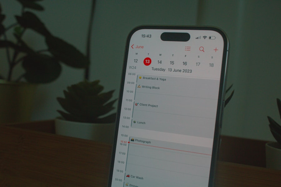
Incorporating Dark Mode Icons and Graphics
| Metric | Description | Recommended Value/Range | Notes |
|---|---|---|---|
| Viewport Width | Initial width for mobile-first design | 320px – 480px | Design templates to fit small screens first |
| Contrast Ratio | Text to background contrast for readability in dark mode | Minimum 7:1 | Ensures accessibility compliance (WCAG AA/AAA) |
| Font Size | Base font size for mobile readability | 16px or larger | Improves legibility on small screens |
| Primary Color Palette | Colors used for UI elements in dark mode | Desaturated, lighter hues on dark backgrounds | Avoid pure black (#000000) for backgrounds; use #121212 or similar |
| Touch Target Size | Minimum size for interactive elements | 48px x 48px | Ensures ease of use on mobile devices |
| Spacing | Padding and margin for mobile layout | 8px – 16px | Prevents clutter and improves touch accuracy |
| Dark Mode Toggle | Option to switch between light and dark themes | Visible and accessible toggle button | Enhances user control and preference |
| Image Optimization | Use of SVGs or optimized images for dark backgrounds | Use transparent or light-themed assets | Prevents harsh contrast or visibility issues |
| CSS Media Queries | Use of prefers-color-scheme for dark mode detection | @media (prefers-color-scheme: dark) | Automatically applies dark mode styles |
| Load Time | Page load speed on mobile devices | Under 3 seconds | Improves user experience and SEO |
Icons and graphics play a significant role in enhancing user experience in dark mode designs. When selecting or designing icons for a dark interface, it’s essential to ensure they are easily distinguishable against the background. You might opt for lighter-colored icons or even consider using outlines instead of solid fills to maintain visibility without overwhelming the user’s senses.
This subtlety can create a more sophisticated look while ensuring functionality remains intact. Additionally, think about how graphics can complement your overall design aesthetic in dark mode. Images should be carefully chosen or edited to fit seamlessly into the darker environment.
You may need to adjust brightness or saturation levels to ensure they don’t clash with the surrounding elements. By thoughtfully incorporating icons and graphics into your dark mode design, you can create a cohesive visual language that enhances usability while maintaining an appealing aesthetic.
Customizing Typography for Dark Mode
Typography is another critical aspect of dark mode design that deserves careful consideration. The right font choices can significantly impact readability and overall user experience. When selecting typefaces for dark mode, prioritize legibility by choosing fonts with clear letterforms and appropriate spacing.
Sans-serif fonts often work well in digital environments due to their clean lines and modern appearance, but don’t hesitate to experiment with serif fonts if they align with your brand identity. In addition to font selection, pay attention to text size and weight. Larger text sizes can improve readability on darker backgrounds, while bolder weights can help important information stand out.
You might also want to consider line height and letter spacing; these factors can greatly influence how easily users can read your content in dark mode. By customizing typography thoughtfully, you can enhance both aesthetics and functionality in your design.
Optimizing User Experience in Dark Mode
User experience should always be at the forefront of your design process, especially when implementing dark mode features. To optimize this experience, consider how users interact with your interface across different contexts—such as during the day versus at night—and tailor your design accordingly. For instance, you might want to include an automatic toggle feature that switches between light and dark modes based on the time of day or ambient light conditions.
Additionally, think about how users navigate through your content in dark mode. Ensure that buttons are easily identifiable and that interactive elements are clearly marked. You may also want to incorporate subtle animations or transitions that enhance usability without being distracting.
By focusing on user experience in your dark mode design, you create an environment that feels intuitive and engaging.
Implementing Dark Mode in Mobile Navigation
Mobile navigation presents unique challenges when implementing dark mode features. As you design your mobile interface, consider how users will interact with navigation elements in low-light conditions. Ensure that menus are easily accessible and visually distinct against the dark background.
You might opt for lighter-colored text or icons within navigation bars to enhance visibility while maintaining a cohesive look. Furthermore, think about how touch targets are sized and spaced within your mobile navigation system. Larger touch targets can improve usability on smaller screens, making it easier for users to navigate without frustration.
Additionally, consider incorporating gestures or swipes as alternative navigation methods; these features can enhance user experience by providing intuitive ways to explore your content in dark mode.
Testing and Tweaking Dark Mode Templates
Once you’ve developed your dark mode templates, it’s crucial to conduct thorough testing before launching them to users. Gather feedback from real users who can provide insights into their experiences navigating through your design. Pay attention to any areas where they encounter difficulties or confusion; this feedback will be invaluable as you refine your templates.
During testing, consider using various devices and screen sizes to ensure consistency across platforms. What looks great on one device may not translate well onto another due to differences in display technology or resolution. Be prepared to make adjustments based on user feedback and testing results; this iterative process will help you create a polished final product that meets user needs effectively.
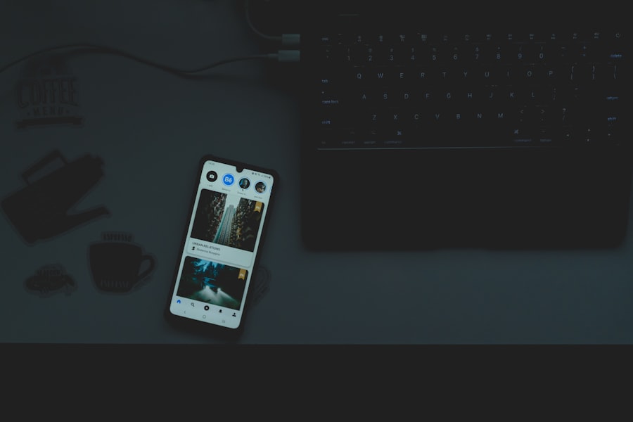
Showcasing Dark Mode Mobile Template Examples
To inspire your own designs, take time to explore existing examples of successful dark mode mobile templates. Look at popular applications that have embraced this trend and analyze what makes their designs effective. Pay attention to how they utilize color palettes, typography, icons, and overall layout; these elements can provide valuable insights as you develop your own templates.
Additionally, consider creating mood boards or collections of screenshots showcasing various dark mode designs that resonate with you aesthetically or functionally. This visual reference can serve as inspiration throughout your design process while helping you identify trends or techniques worth incorporating into your work.
Tips for Maintaining Consistency Across Light and Dark Modes
Maintaining consistency across light and dark modes is essential for creating a seamless user experience. As you develop both versions of your design, ensure that key elements—such as branding colors, typography choices, and iconography—remain consistent between modes.
Additionally, consider creating a style guide that outlines specific guidelines for both light and dark modes. This resource can serve as a reference point throughout the design process, helping ensure consistency across all aspects of your project. By prioritizing uniformity in your designs, you create an experience that feels polished and professional regardless of the user’s chosen interface setting.
In conclusion, embracing the dark mode trend requires thoughtful consideration across various aspects of design—from color palettes and typography choices to accessibility features and user experience optimization. By following these guidelines and continuously refining your approach based on user feedback, you can create compelling dark mode designs that resonate with audiences while enhancing usability across platforms.
In addition to learning about designing mobile-first templates that look great in dark mode, you might find the article on best email marketing strategies to increase sales particularly useful. This resource provides valuable insights into optimizing your email campaigns, ensuring that your designs not only look appealing but also drive engagement and conversions.
FAQs
What does “mobile first” design mean?
Mobile first design is an approach where the design process starts with the smallest screen size, typically smartphones, and then scales up to larger screens like tablets and desktops. This ensures the website or app is optimized for mobile users before enhancing the experience for larger devices.
Why is designing for dark mode important?
Designing for dark mode is important because many users prefer or require a darker interface to reduce eye strain, save battery life on OLED screens, and improve readability in low-light environments. Providing a dark mode option enhances user experience and accessibility.
How do you ensure templates look good in both light and dark modes?
To ensure templates look good in both light and dark modes, designers use color palettes that provide sufficient contrast, avoid colors that clash or become unreadable in dark mode, and test the design extensively in both modes. Using CSS variables and media queries like prefers-color-scheme can help implement these changes efficiently.
What are some key considerations when designing mobile first templates?
Key considerations include prioritizing content hierarchy, ensuring fast load times, using responsive layouts, optimizing touch targets for fingers, and minimizing clutter. The design should be simple and intuitive, focusing on essential features for mobile users.
How can CSS be used to support dark mode in mobile first templates?
CSS can support dark mode by using the @media (prefers-color-scheme: dark) media query to apply different styles when the user has enabled dark mode on their device. CSS variables can be defined for colors and easily switched between light and dark themes without duplicating code.
Are there any tools or frameworks that help with mobile first and dark mode design?
Yes, many frameworks like Bootstrap, Tailwind CSS, and Material UI offer built-in support for responsive design and dark mode. Additionally, design tools like Figma and Adobe XD provide features to prototype and test dark mode alongside mobile layouts.
What challenges might arise when designing mobile first templates for dark mode?
Challenges include maintaining sufficient contrast for readability, ensuring images and icons look good on dark backgrounds, managing color consistency, and handling user preferences for theme switching. Designers must also consider accessibility standards to accommodate all users.
How can designers test their mobile first templates in dark mode?
Designers can test templates by using device emulators, browser developer tools with dark mode simulation, and real devices set to dark mode. User testing and feedback are also valuable to identify any usability issues or visual inconsistencies.