Email Accessibility is about sending a message in a way that everyone understands even with certain disabilities. Previously, people with certain disabilities were unable to access the internet. With the arrival of the latest technology, some platforms have emerged on the horizon to facilitate these individuals to mainstream them with others.
Let us take YouTube as an example. For many years, the platform was not compatible with the visually impaired, and blind until a YouTuber named Tommy Edison along with other members compelled YouTube to make it more supportive.
Likewise, if you are an email marketer, you have to make sure that your message is getting across not only to the fittest but to everyone with any kind of disability. It will help you to make your message even more effective to increase your return on investment.
It is quite obvious that you spend a decent time making sure that the message looks perfect. Do you give equal time to it to figure out if your message is accessible to everyone?
According to the Centers for Disease Control and Prevention (CDC), around one in every four or 61 million adults in the USA live with a disability. This is a huge number that should not be overlooked while designing your message.
In this article, we shall what is email accessibility, and some best practices to optimize your message.
Table of Contents
- What is email accessibility?
- Why do accessible emails matter?
- Why should you design accessible emails?
- What conditions should be considered for email accessibility?
- Technical Compatibilities
- Human Disabilities
- Email accessibility best practices
- Make your subject line and preheader descriptive
- Don’t rely on the colors only to emphasize focal points
- Do not send image-only emails
- Use responsive design
- Use suitable font sizes
- Tag your images with alt text
- Never use all caps
- Do not justify the text
- Use emojis wisely
- Write a readable copy
- Use Mumara One for designing the best campaign
What Is Email Accessibility?
Email accessibility has become the talk of the town over the past few years. Primarily it is about sending emails in a way that the message can be read and understood by every subscriber without taking their disabilities into account.
While designing an email message you must be aware of the basic information and understand several aspects. For example, if you have some subscribers with color blindness, and you add a blue call to action in the email, they will not be able to find it. To overcome this issue, either you need to use a different color or a different typeface.
Mark Robbins says,
“As email developers, we spend hours getting an email to look just right in a client with less than 1% market share but very few of us will spend a few minutes making the email accessible.”
Why Do Accessible Emails Matter?
Many people in the world live with some kind of disability. This larger chunk can prove itself to be highly decisive for the success of your email marketing campaigns. Sometimes, marketers send emails to users without knowing about the disabilities of the clients.
As per the stats of the World Health Organization (WHO), more than 1 billion people in the world live with some sort of disability. Around 2.2 billion people face distant or near vision impairment around the globe.
Not only this, 8% of the men and 0.5% are facing color blindness. According to an estimate, approximately 2.5 billion people have some kind of hearing loss.
These stats are evidence that a lot of people are facing issues in performing tasks normally. If your messages are not accessible, you are creating a barrier for people with a poor email experience.
Why Should You Design Accessible Emails?
Making emails accessible needs to be your priority and the core of your email marketing strategy. This practice helps in your business and reputation growth at the same time when you give your users a better experience.

Here are some of the reasons to design your email accessible:
- If your emails are accessible, you will get a chance to reach more users – resulting in more sales.
- It is human tendency to give equal chances to all and sundry. If you design your message where you address every segment of society, it makes you more human.
- Some marketers still do not make emails accessible. It is a good chance for you to stand out from the competition to be recognized as a more empathetic brand.
- If your message is accessible without any problem, it will increase your brand’s credibility and value.
What Conditions Should Be Considered for Email Accessibility?
There are two different conditions you need to consider while designing accessible emails:
- Technical Compatibilities
- Human Disabilities
Technical Compatibilities
Sometimes, technicalities alter the email code and the emails do not appear as intended. These technicalities are linked with the devices on which the emails are being displayed, and the browsers:
Devices
Statistically, 16.4% of emails are viewed on the desktop, whereas, 42.4% are on mobile phones. The rest of the 41.2% of emails are viewed on other devices.
It means that there is a variety of devices where people see the message. You have to make your message readable on all devices to show uniformity.
Browsers
Users use different browsers to view your emails. Some of them might use Apple mail, and others iOS mail. These browsers come up with different configurations and there are chances that your email may display differently on the different browsers. You must understand the basic technicalities before you send the email campaign.
Human Disabilities
There are possibilities that your user might have different disabilities. These disabilities abstain to engage with your message if not designed according to them.
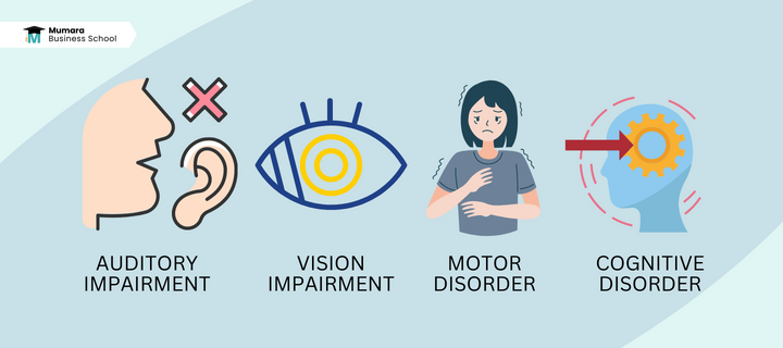
There is another drawback of making messages not compatible with these users is that they will get annoyed by your messages.
Instead of getting positive results out of them, you will be liable to be marked as spam straight away – resulting in a bad IP reputation. Some of the major human disabilities are here you need to know:
Vision Impairment
Vision impairment means loss of vision or sensitivity to color. Users with vision impairment use special screen readers and keyboard commands to get to know about the message content.
Cognitive Disorders
Users with cognitive disorders are affected by brain impairment. These subscribers lack processing ability, therefore, you need not send overloaded messages with too much information. Not using enough white spaces, long paragraphs, and too many emojis are not good for these users.
Motor Disorder
Motor disabilities mean physical disabilities such as muscle weakness, broken arms, etc. that make it difficult to navigate through emails.
Creating short buttons and links make it difficult for these users to click through the call to action. As a marketer, you need to think about email accessibility issues when you design your email campaign.
Auditory or Hearing Impairment
Users with hearing impairments are unable to differentiate the different sounds of the words. This makes the users unable to understand the sentences.
The best solution for this issue is to add transcriptions, captions, and subtitles when you add a video or audio link.
Email Accessibilities Best Practices
Capterra has conducted a study and concluded that 83% of marketers are doing more efforts to send accessible emails. In the contemporary scenario, you have to step up with the recent trends to make the best impression in the market.
Here are the tested email accessibilities best practices to optimize your message:
Make Your Subject Line and Preheader Descriptive
The subject line is the face of your email. While designing an email campaign, do not underestimate the power of a subject line because when it is well written, the recipient will open up your email.

What if you design your email body so well with the perfect colors but no one opens it? What will be the use of this practice for your brand? It hardly needs any comment.
To cherish the users with the best, you need to encapsulate the most important message briefly in the subject line in 50 characters or less.
While writing your subject line, make sure it is compatible with the actual message, otherwise, it will disappoint the users.
Likewise, the email preheader is another important thing your users see before opening up the email. The preheader needs to be clear for the users without creating any ambiguity and compelling to convince the users to open the email.
Don’t Rely on the Colors Only to Emphasize Focal Points
Colors are important in designing your email undoubtedly. When there are some subscribers with visual impairments, you need to focus on the color scheme. Do not rely on the colors only to emphasize a certain message.
Rather, create a balance by keeping all types of users in the mind. Check the contrast ratio and think about people with color blindness. If you stress about the colors too much, it means that your message will not be received by everyone the way you want.
What is the use of colors for the recipients with colorblindness? Balance is everything in marketing and you have to stick with this theory to make your mark perfectly.
Here, we do not mean that you must avoid the colors in the email completely. We suggest you use colors but for the unimportant factors. If there is something important to mention in the message, use black and white to increase the conversion rate.
Do Not Send Image-Only Emails
It is easy to upload an already designed email image, but difficult for the users to comprehend it with a certain disability.
From the recipient’s standpoint, you have to send a message designed for everyone instead of keeping a certain segment of society in mind. If you upload all the content with a picture, it will not allow you to get your message across to the screen readers.
Along with it, if your call to action (CTA) is inside the image, voice and screen readers will not able to understand it. This will decrease engagement on one hand, and sales on the other.
Use a Responsive Design
This is an open secret that people use different devices to see the message including desktops, smartphones, tablets, etc. While designing your message, make sure that your content formats correctly.
If the design is not responsive, your user will get a poor experience and the screen readers will not be able to get the message.
Mumara One allows you to send a preview email before you send the final campaign. Therefore, before sending the final message, double-check it to see how the message appears on mobile, desktop, and other devices.
Use Suitable Font Sizes
The smaller fonts are not a good idea to design your message. When you send an email with a small font size, a partially blind, or a person who is reading in the sunlight will not be able to read your message properly.
On the contrary, using a large font size can also be annoying for various users. According to the rule of thumb, the font size should be around 14px.
Tag Your Images with Alt Text
The subscribers with disabilities block the images from being received in the emails because the flashy content can cause issues. The screen readers cannot see the images in the emails.

The best solution for this matter is to tag the images with alt text. Alt tags are readable by screen readers and search engines.
Make sure that the alt text should be a brief description of the image. On the other hand, if want to send the video or a video link in the email, include a text summary for readers with auditory impairment.
Never Use All Caps
A dyslexic is a person with a problem in reading, spelling, and writing. Using all caps is harder to read for these people. Not only this, using all caps feels like shouting, always avoid it.
A statement written in all caps needs unnecessary extra attention to read the text. 5% to 15% of people are dyslexic, and writing everything in caps will make it difficult for them to understand and differentiate between the different letters.
Do Not Justify the Text
A justified text might be good for designing point-of-view but not understandable by dyslexic users. Sometimes, the justified text creates large uneven spaces between letters and words.
These uneven spaces distract the user’s attention by killing the actual sense. Dyslexic users continuously affect by this problem, losing interest in the message with irritation. Always use left-aligned text for your paragraphs instead of making them justified.
Use Emojis Wisely
Playing with emojis is not only fun but also it is a good way to grab attention. Subject lines with emojis come up with brilliant open rates.
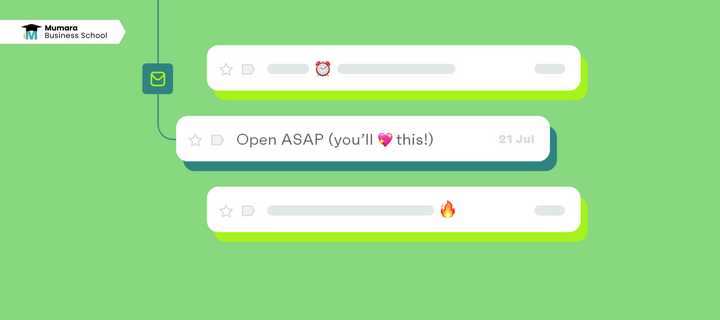
But you need to keep the point in mind that never use emojis in the place of a word. Use them at the beginning of the message, or at the end to look different in the mailbox.
Use emojis in the email when you think it is valuable. Do not overload the email with emojis but create a mesmerizing beauty with the mixture of words and emojis.
Write a Readable Copy
Making your email body content more human is necessary to increase email accessibility. Accessible emails depend not only on the fact around how the emails are coded, but those emails are written too.
The copy with more readability is responsible to give more conversion rate as it is more understandable.
Flesch-Kincaid Reading Ease Test is one of the most popular readability tests to calculate how easy your content is to read on a scale of 0-100.
- If the score is 90-100, it means the content is understandable by an 11-year-old student.
- If the score is 60-70, it means that the content is understandable to a 15-year-old student.
- If the score is 30-50, it means that the content is fairly difficult to read, and understandable only by college students.
- If the score is 0-30, it means that the content is difficult, and understandable by a university graduate.
Making your content readable does not mean avoid on writing tricky topics. It means that you have to pick weighty topics and write in a way that an average person understands it.
If you keep your score between 60 to 70, it means that you have created a fairly easy-to-read copy.
Use Mumara One for Designing Your Best Campaign
On Mumara One, you use HTML Editor and Drag & Drop Builder to design your message. You will be able to run A/B testing before you send a final copy to the users.
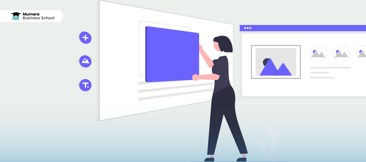
You can send countless email campaigns with perfectly designed email subject lines and preheaders. Also, send a preview email to your desired email address before clicking send button to view what it looks like.
Sign up to Mumara now for more features.
Click for more Email Marketing Blogs.


Add comment